%202.png)
.png)
The Team Member Discounts page gives Alberta Blue Cross® employees access to discounts and special offers from a variety of providers.
The original page displayed all discounts on a single long page, creating a lengthy scrolling experience. There were also no icons or clear visual sections to help employees distinguish between different types of discounts.
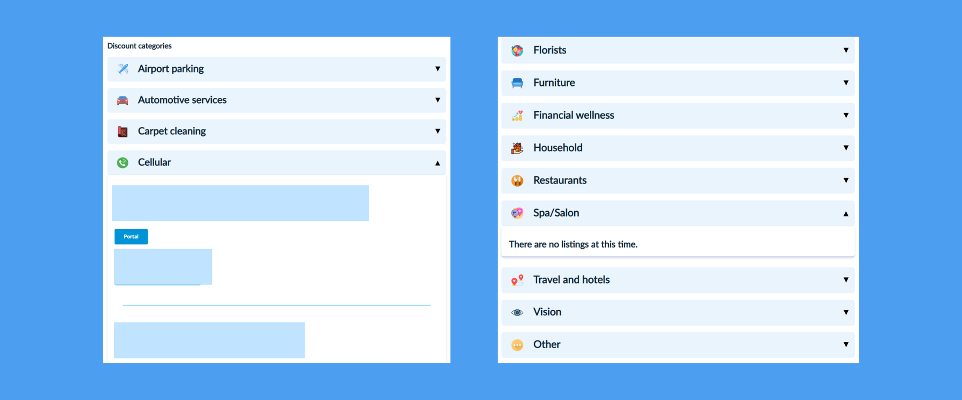
I redesigned the experience by introducing categorized sections, expandable accordions, and visual category icons, making the page easier to scan and allowing employees to focus on the discounts most relevant to them.
The existing page contained valuable information, but the way it was presented made the content difficult to browse.
All discounts were laid out on one long page, requiring employees to scroll through large amounts of information to find a relevant offer.
Discounts lacked clear visual separation between categories, making the page feel dense and difficult to scan.
The page did not use icons or other visual cues to help employees quickly recognize different types of discounts.
Goal:
Create a more structured and scannable experience that made existing discount information easier to browse and discover.
I reviewed the existing Team Member Discounts page, analyzed pre-launch analytics, and collaborated with internal stakeholders to identify opportunities to improve how employees browsed and discovered available discounts.
Reviewed the existing page structure and content to identify areas where the long scrolling layout created friction.
Reviewed pre-launch engagement data to establish a baseline for how employees interacted with the existing page.
Worked with HR, Benefits, and Internal Communications stakeholders to understand content priorities and ensure the redesigned structure could support future discount additions.
The primary challenge was not the amount of information available, but how that information was presented.
Employees had to scroll through a long page of discounts without clear visual separation or category cues. A more structured information architecture could make the existing content easier to scan and explore.
The redesign focused on reducing the long scrolling experience while making discount categories easier to recognize and explore.
Introduced expandable accordion sections so employees could open only the discount category they wanted to explore.
Grouped discounts into distinct categories to establish a stronger visual hierarchy and make the page easier to navigate.
Introduced category icons to help employees quickly recognize different types of discounts while scanning the page.
I reviewed the existing discount content to understand how information was organized and where the existing layout created unnecessary friction.
The page was reorganized from a single list of discounts into a category-based structure, allowing employees to browse by type and expand sections to access individual offers.
.png)
I explored different ways to organize the discount categories and individual offers while reducing the amount of content employees needed to navigate at once.
Iterations focused on:


The redesigned page uses a clearer content hierarchy and visual organization to make discount information easier to browse.
The redesign saw modest growth in overall visitors, while engagement increased more significantly. Engaged sessions increased by 19.2%, while page views increased by 78.2%. Pages per visitor also increased from 2.37 to 3.95, indicating that employees explored more of the available discount content after the redesign.
These results suggest the redesigned structure made it easier for employees to browse and engage with the available discounts.
This project reinforced that effective enterprise UX is often about making existing information easier to access, rather than adding more content.
The biggest improvement came from restructuring the page around how employees actually browse information. By replacing the single long scrolling layout with categorized sections, expandable accordions, and visual cues, I created a more organized and scalable experience.
If I continued the project, I would explore search and filtering to help employees quickly find specific providers or discount types, as well as analyze engagement by category to better understand which benefits employees use most.